Tutorial
Introduction to the EKIPRO project
EKIPRO is a project of the Institute of Digital Medicine (IDM) at the UKA. EKIPRO is an acronym for "Clinical Decision Support using Explainable Artificial Intelligence on the Example of Prostate Cancer".
As you can already see from the project title, one goal of the project is to find out how trust in Clinical Decision Support Systems (CDSS) can be improved using Artificial Intelligence (AI) and eXplainable AI (XAI). This goal is pursued using prostate cancer as an application example.
Until now, Gleason assessment of a prostate specimen has been performed manually by experts, and the tasks can be very subjective for individual pathologists.
In this scenario, a CDSS could - at least in theory - reduce pathologists workload and improve patient care by providing a more accurate and objective assessment.
In addition, highly accurate AI explanations could also help detect errors and highlight previously overlooked features.
These opportunities for improvement form the use case for this study. To test the accuracy of assumptions about CDSS, a pipeline was created to determine the Gleason score of prostate samples.
This was done using a small dataset created specifically for this project in collaboration with UKA.
Similar automated classifications using AI pipelines have already been developed and have shown a very high success rate, being much more accurate than expert classification.
However, the focus of the evaluation in which you are involved is not on looking at the accuracy of AI, but on improving the acceptance of AI systems by showing how and why a classification has been made. This is done using eXplainable Artificial Intelligence (XAI) methods.
In the following evaluation, you will learn about many different XAI methods that aim to shed light on the internal workings of black box AI.
All of these methods use different mathematical algorithms to explain the Deep Neural Network used for Gleason score classification.
Not all XAI methods will provide a meaningful result for all use cases, and that is what this evaluation is about.
With your help, we want to find out if XAI will improve your understanding of Gleason scoring AI and which methods are most helpful for this use case.
Within the evaluation, you will work through a series of prostate punches. The individual punches will be viewed in a viewer showing the different stains previously calculated by the AI and the different XAIs.
Using the different coloring methods of the different eXplainable Artificial Intelligence methods, you will be asked to evaluate them using a pre-made evaluation sheet.
Background
To give you an understanding of the principle of Artificial Intelligence (AI) and eXplainable AI (XAI), here is a short note.
While you classify tissues based on cell structures of their changes, AI may use other clues unknown to us.
The XAI is meant to make these clues clearer to help you understand the decisions of AI (similar to how your studies taught you to look for specific cell structures or changes when looking at histological tissue).
Accordingly, the areas of tissue that were relevant to your Gleason classification do not have to be identical to the areas that were relevant to the AI in order to arrive at the same Gleason classification, and thus were flagged by the XAI.
In addition, it is important to note that unlike humans, AI does not consider the tissue as a whole, but divides the tissue into tiles and considers each tile independent of the tiles around it.
If you want to learn more about Artificial Intelligence (AI) and eXplainable AI (XAI), as well as the different methods, please have a look at our Wiki. In the wiki, we try to explain the most important terms and how the mentioned methods work in a simple way.
This way, you can hopefully better understand what AI did and how it came to the presented result.
Navigation on the website
 There are two ways to navigate the web page.
The first option is to use the blue colored navigation bar at the top of the web page. On it you can navigate between the different subpages of the website.
- Start Page: "Home Base". Here you get an overview of the punches that have been selected for evaluation from. Under "TODO's" are listed the punches for which the evaluation is still pending, while under "DONE's" are listed the punches for which the evaluation has already been performed.
- Wiki: Here you can find more detailed information about the project, the tool and the methods used.
- Tutorial (this is where you are currently located): Here is a short overview and introduction to the project and the tool.
- User (top right icon): You have to navigate to this subpage if they have worked through the tutorial. Here you have an overview of your user and can log out of the application after the evaluation.
To switch between the pages, you just need to click on the appropriate box at the top, in the bar.
The second navigation option opens on the user dashboard, or as soon as you have logged in. Once you have logged in, the application guides you through the entire evaluation process via the conspicuous green buttons.
The tool
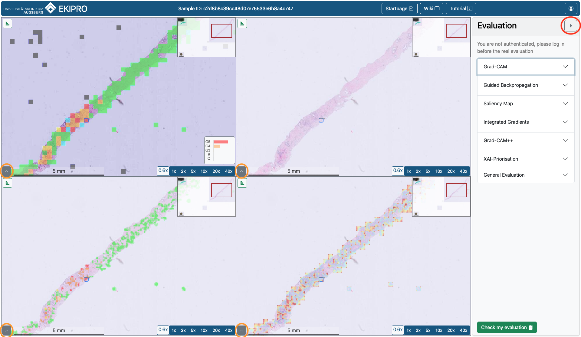 Each prostate sample will open in a four tile window. The same sample can be seen in all four fields.
 The sample ID is visible at the top, above the four fields, while the navigation buttons moved to the right.
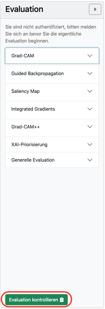
Next to this viewer you can see the evaluation form.
You can hide it by clicking on the triangle circled in red in the upper right corner of the evaluation form. If you click on the triangle again, the form will reappear.
If you click on the gray boxes in the lower left corner of each image field (they are circled in orange in the image), a field "+ Add overlay image" appears. Here you can also see if/which overlay is currently applied. You can find more information about the overlays in the corresponding chapter, further down.
If you click a second time on the triangle circled in orange, the overlay overview disappears again.
If you move the mouse pointer to a certain position of the sample (best with high magnification), a border and a small tile with a diagram will appear for this position.
The border describes the image section that the AI takes into account in its classification for this area.
The diagram shows the safety of the AI for its classification of the section. A large bar indicates a more certain assessment.
The Artificial Intelligence marks, using the Gleason scoring system, whether a tile is pathologically interesting/noticeable.
The eXplainable AI, on the other hand, marks locations or areas that may have been decisively relevant to the decision of the AI, but this does not mean that the areas are pathologically interesting.
You can zoom either by using the wheel on your mouse or by clicking on the fields "1x"; "2x"; ... ; "40x".
The movements you make in one of the four fields are automatically made in the other three fields, so that the same area of the sample is always visible in all four fields.
If you rest on a point on the sample with the mouse, a bar graph will appear, with the probabilities for the different grading possibilities. If you want to turn off the appearance of this bar graph, you should click on the small bar graph icon in the upper left corner of the respective field. The icon is now colored red. Thus, the bar chart for this field will not appear anymore. To turn it on again simply click on the small bar chart icon again.
Take plenty of time to get to grips with the tool and the various views.
Presets
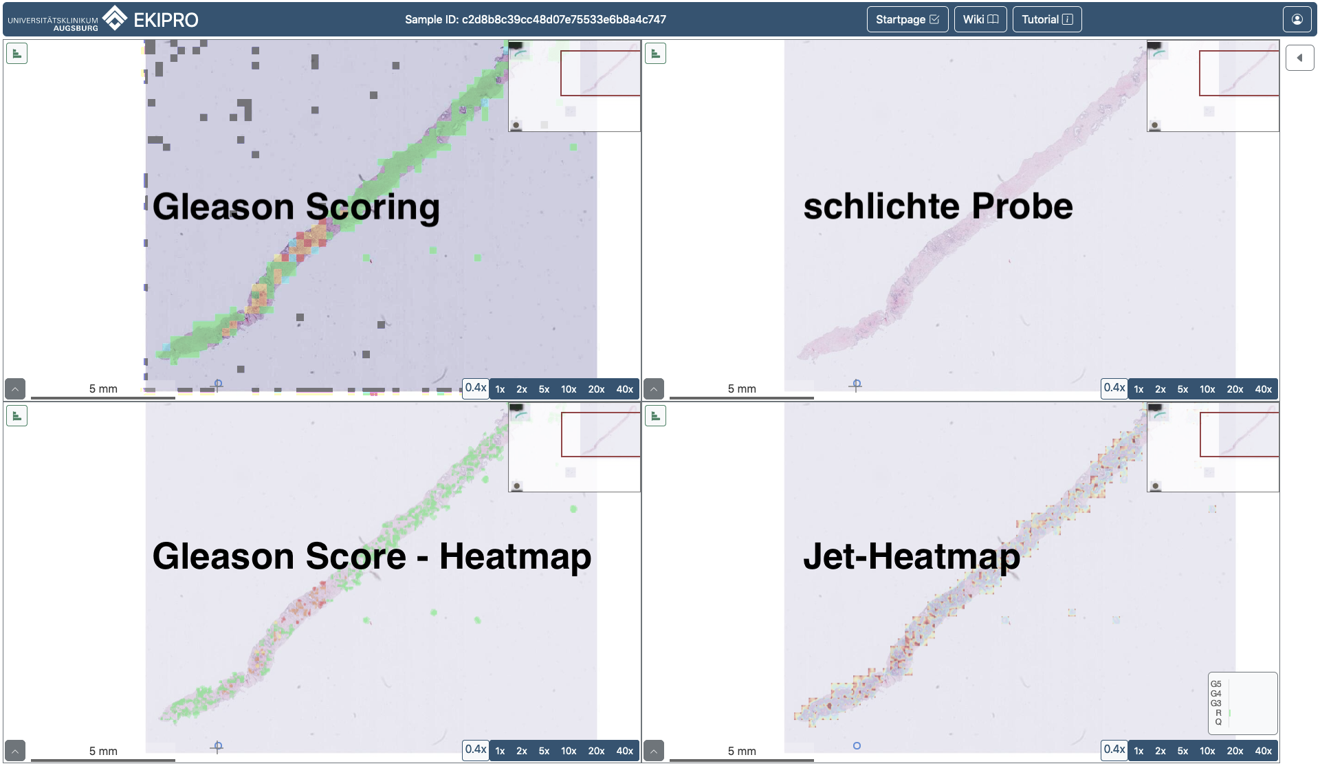 During the evaluation process, the viewer will open the sample in four fields, as described in the previous section.
 For each XAI to evaluate, the Viewer will automatically load a configuration of presets into the fields. These presets all have the same structure:
| Gleason Scoring | empty, bare sample |
|---|---|
| Gleason Score-Heatmap | Jet-Heatmap |
Gleason Scoring AI visualizes the classification done by our AI.
The top right field depicts the bare sample without any artificial colouring.
The bottom left field visualizes the Gleason Score Heatmap. This field uses the selected XAI to create heatmaps for all Gleason Scores found within a patch with a certainty of over 30%. The areas which were then over 60% relevant to the decision for the corresponding Gleason Score are then marked in the corresponding colour.
The bottom right field visualizes the Jet-Heatmap. This field uses the selected XAI to create a heatmap based only on the main Gleason Score of the selected patch. This heatmap marks areas of the patch which were relevant to the decision of the AI, visualizing theses areas using the Jet color scheme, details to which can be found in the Colour section of the tutorial.
Important to remember here is, that the XAI mark areas relevant to the decision made by the AI for the corresponding patch, this does not mean that the marked areas are inherently pathologically relevant. Or that the marked areas of one patch correspond to the marked areas of another, adjacent patch.
The used heatmaps are:
- sm: Saliency Map, an XAI method that pinpoints areas that had the greatest change in the AI's decision regarding
that particular patch . - gc: Grad-Cam. This XAI colours each tile/patch in a gradient called a heatmap. Here, areas relevant for the AI's decision are highlighted more.
- gc++: Grad-Cam++, similar to Grad-CAM, areas are also highlighted here, although the color gradients should be a little different.
- gb: Guided Backpropagation, similar to Saliency Maps this XAI also marked selective areas which were relevant for the decision of the AI.
If you are interested to learn more about the different overlays and XAIs please refer to the corresponding section in the Wiki-Site.
Color Scheme
 In the viewer, two different color schemes are used for colouring the sample in the four fields.
 The AI and the Gleason scoring heatmap use a kind of traffic light system:
questionable tissue
regular tissue
Gleason Score 3
Gleason Score 4
Gleason Score 5
The Jet heatmaps uses the Jet color scheme, here the a color gradient from cold colours, not relevant for grading, to warm colours, relevant for grading.
All colourmaps are placed over the sample with an opacity of 50%.
The Playground
If you want to get acquainted with the tool without login before evaluation (which we highly recommend), you will find a sample punch on the home page.
Use all the functions of the viewer as you like!
As long as you are not logged in, no actions are saved.
Use all the functions of the viewer as you like!
As long as you are not logged in, no actions are saved.
Start the evaluation
Once you have familiarized yourself with the tool, you can start the evaluation. To log in, access the user menu located at the top right of the page and click on "Login". Follow the instructions provided by the green buttons.
After you have logged in, please fill out the "Pre-Evaluation" form.
After you have completed this form click on the "Continue to the evaluation" button and select a punch under "TODOs" for the evaluation.
You perform the evaluation by answering all the questions in the evaluation module, for all the punches visible on the home page.
This will load a specific preset of overlays for each part of the evaluation.
You can adjust your answers to past questions at any time.
Once you have answered all the questions in the evaluation module, click the "Check Evaluation" button at the bottom left of the evaluation form (red circled button in the image).
When you receive a message about the successful completion of the evaluation, you can go (via the home page) to the evaluation of the next punch.
Quick reminder: please remember that Artificial Intelligence (AI) marks conspicuous/pathologically interesting tissue, while Explainable Artificial Intelligence (XAI) only marks interesting Areas of interest for the AI's decision making. It is important to note that the tissue marked by XAI is not necessarily pathologically interesting.